Great experiences
build great brands.
Welcome to Slinky. Make yourself at home. We provide professional web design in Perth. We create websites to communicate what’s great about your business. We will help you tell your story with a powerful website that works. Start growing your business today.
RECENT WORK

Sorgiovanni Designs
WordPress, CMS, Web Design

Art Of Seafood
WordPress, Web Design, CMS, Hosting

Calneggia Family Vineyards
WordPress, Web Design, Hosting

Luxury Villas Bali
WordPress, Web Design, CMS, SEO

Empire Retreat
WordPress, Web Design, Website Hosting

Tomizzi Builders
WordPress, Web Design, Website Hosting

Helibiz
WordPress, Web Design, Website Hosting

Street Life
WordPress, Web Design, Website Hosting

Landscapes WA
WordPress, Web Design, CMS, SEO

Jordan Love Racing
WordPress, Web Design, Website Hosting
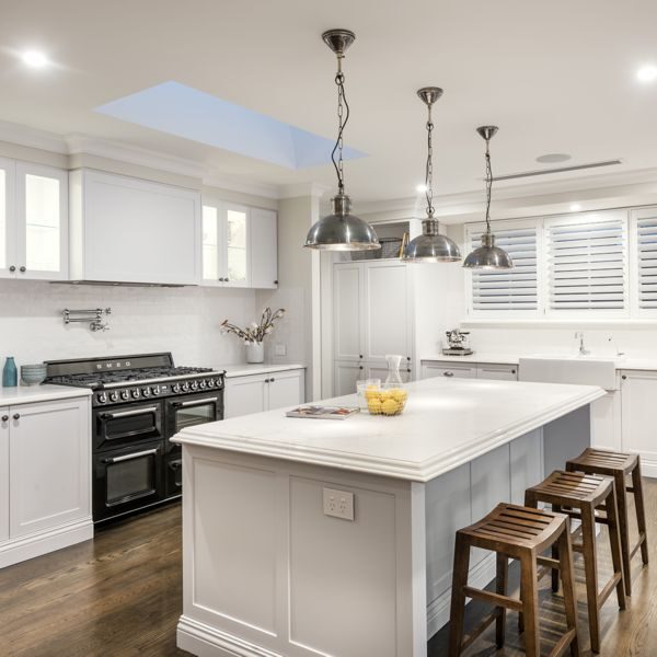
Colray Cabinets
Web Design, SEO, Website Hosting

Echo Marine Group
WordPress, Web Design, Website Hosting
Our creative designers will make your brand stand out from the crowd. Your website will look great on either desktop or mobile devices. Talk to our designers today.
We have website maintenance packages designed to help you worry less about your WordPress website, knowing it is being cared for by our professionals.
We provide SEO and Google Ad services. We have an excellent track record of delighted, loyal clients. View our seo services – or checkout SEO Perth Experts.
Some of the people we have worked with


What our clients say
Client testimonials
I’ve just had a look at the website and looks fantastic!! …Thank you so much for keeping to the rather short time frame – we are thrilled with the end result.
Tanya Hawtin / The Lawncare Man

I just wanted to say a few words of appreciation for the good job you and your guys have done on this project! It was a pleasure working with you!
Steve Uspensky / AlloySteel International

Wow it looks amazing, easy to follow and I especially love the ‘contact’, brilliant. Brilliant work, thank you so much for being so efficient and professional. Thanks.
Nadine Tomizzi / Tony Tomizzi Builders Pty Ltd
Read more testimonials
About us
Our whole team share a passion for translating a great idea into an innovative user experience
Slinky Web Design is a professional web page design company with a simple strategy to produce beautiful web pages and gain for our clients, high ranking positions in all the major search engines, such as Google. We are a Google Partner company with the required expertise to provide you with a solution to stand out in your marketplace. Read more about us

Responsive websites
Responsive web design allows optimal viewing of websites on a wide range of devices from desktop computer monitors, laptops to mobile phones or tablet devices.
Over the past couple of years, responsive websites have become a hot topic in the online community and is fast entering the realm of standard practice. Responsive websites respond to their environment which basically means websites should adapt their layout and design to fit any device that chooses to display it.
- Suitable for all mobile devices
- Optimised for loading speed
- Thoroughly Tested
There are several reasons why responsive website design is important.
The first is that businesses no longer have the expense of having multiple websites, each suitable for the various devices they may be viewed on. Instead, only one website needs to be built. but it responds to the device being used. Another benefit is that you only have to maintain and look after one website instead of two.
Next, is the fact that responsive websites will load quicker on mobile devices than those which are classed as ‘mobile’ websites. This not only improves the users’ experience but is a positive in the eyes of Google, who reward fast loading websites, and penalise slow loading websites, with the respective move up or down on their rankings, to follow.
While mentioning Google it is also important to note that Google now sees mobile searches as having a higher priority than searches made on desktop computers. This means that their search results are going to be biased towards responsive websites that can be viewed perfectly on mobile devices.
You also have to take account of the fact that many, if not most, of your potential customers, are more likely to use their mobile devices as they go about their day, than their desktop computers. You want to be in front of those customers when they are searching for what you offer, and if your website isn’t responsive, then they will never find you.
eCommerce websites
We are eCommerce website designers & developers based in Western Australia - servicing all of Australia.
Effective eCommerce is about strong technology and great marketing. Slinky have been delivering customised eCommerce designed shopping carts for clients of all sizes since 2000. The greatest challenge in building a successful eCommerce website is ensuring that the conversion rate of the website is high.
eCommerce & mobile devices
The simple fact is that people, and more importantly, customers, are changing the way they purchase goods and services online. For a start, the amount of information available to them is greater than ever before, so in advance of any purchase they have the means to check out the company’s track record, and in particular reviews from its customers.
The most significant change is that mobile traffic on the internet has overtaken desktop traffic which means your potential customers are more likely to be visiting your website on a mobile device. To ensure that you take advantage of that fact, it is essential that your eCommerce website is suited to mobile devices. The way this is achieved is by making it responsive, and thus able to adapt to the screen size of the device being used.
If it is responsive then your eCommerce site can more or less operate as it would on a desktop computer, albeit there may be some visual elements that change. That being said, in terms of visitors being able to browse through your website, gather information about your products, and ultimately being able to purchase them, should be as straightforward on a mobile device, as it would be on a desktop one.e
A number of key elements obviously have to be in place such as payment processing, and security. Normally, these would be part and parcel of the development of your eCommerce website when it was being created, or subsequently upgraded to include them.


Website content
What content should I have on my website?
The beauty of modern web design is that there are so many options available for content that you are almost spoilt for choice. Ideally, it would be best if you aimed to have a mix of content, and more desirable than that, a content mix that research shows is popular with the sorts of visitors you are hoping to attract to your website.
The most common type of content is the written word, which can serve several purposes. The first is that it engages your audience, provides them with information and advice, and hopefully entertains them if that is what it is designed to do.
Another benefit of written content is it provides Google with information on the subject matter of your websites and the keywords you wish to rank for. Text can also be used to create hyperlinks to other pages within your website or other websites as part of your SEO optimisation strategy.
The forms of content that you can use text for include case studies, white papers, blog posts, checklists, guides, ‘how-tos’, reviews and written interviews.
Video plays a huge role on the internet and is a form of content you should consider. A 30-second video can often be more effective in engaging a potential customer than 500 words of text.
Images also play an essential role, not just as a form of content, but in enhancing the design and user-friendliness of your web design by breaking up pages and chunks of text. You could combine images and text to create memes and infographics, which are extremely popular.
Website development
What is web development?
Web development is a function that relates to the coding and programming of websites. In effect, web development is what builds the structure and functionality of a website, rather than the visual design of it. It might be regarded as a more technical function than the design, although that is not to say that designing a website doesn’t take a lot of skill and technical know-how.
For web development, several coding and programming languages may be used such as HTML, JavaScript, and CSS. These not only allow the website to be built but once it goes live these programming languages enable the website to function. The functions can be many and varied depending on the size and complexity of the website.
Web development is also what allows visitors to the website to interact with it. Examples of this can range from a simple pop-up asking for the visitor’s email address, to a fully functioning e-commerce website, including product videos and payment processing.
The coding that web developers use can be from several sources and in most cases, a combination of these is used. They may be skilled enough to write their own code from scratch, they may employ a software company to create bespoke coding, and they may use numerous pieces of pre-written software which they incorporate into the website they are building.
Web development impacts on both the front end of the website and the back end. The front end can be the coding that allows an embedded video to play and be watched by visitors. Backend coding might relate to the SEO metadata, which is seen by search engine spiders, but not visitors to the website.

Digital marketing
How do I get prospective clients / customers to find my new website?
If you are in need of digital marketing, we have a highly experienced team available to help with all your needs. Whether it be SEO, Google ad campaigns, email marketing or social media campaigns, talk to us today.


